The Beginner's Guide to Choosing a Paint Colour for North-Facing Rooms

A north-facing room has a reputation among decorators, and much of it is earned. You get soft, even light all day and no harsh glare bouncing off the walls, which sounds ideal on paper. Then you paint a wall in the tasteful grey you loved in the shop, and it dries to something flat, chalky and faintly blue. Nothing has gone wrong with the paint. North light simply behaves differently, and once you know what it does to colour, the whole business of choosing becomes far less of a gamble.
How north light actually behaves
In the northern hemisphere, a north-facing window almost never receives direct sun. Light arrives indirectly, bounced off the sky, which makes it cool, blue-leaning and remarkably even. It's flattering to faces and unforgiving to colour.
Two things happen as a result. First, warmth drains out of a room. A colour that looked golden on the sample card can read as putty on the wall. Second, the light changes through the day and through the year: bright but grey on a July overcast, thin and dim by mid-afternoon in January. North rooms also pick up whatever is outside the glass. A lawn, a hedge or a grey rendered wall all bounce their own colour back in.
Undertones are the whole game
Every paint colour is built on an undertone — the barely-there cast that sits behind the main shade. A north-facing room will magnify a cool undertone and mute a warm one, so a greige with a hint of blue can turn distinctly chilly, and a green with a blue base can look dingy rather than fresh.
Before you commit, hold the swatch against a sheet of white paper in daylight and compare it with two or three neighbours from the same fan deck. Put it next to your floorboards, your sofa, your kitchen cabinets. Then follow the rule that saves most north-facing schemes: go one step warmer than you think you need.
Whites and neutrals
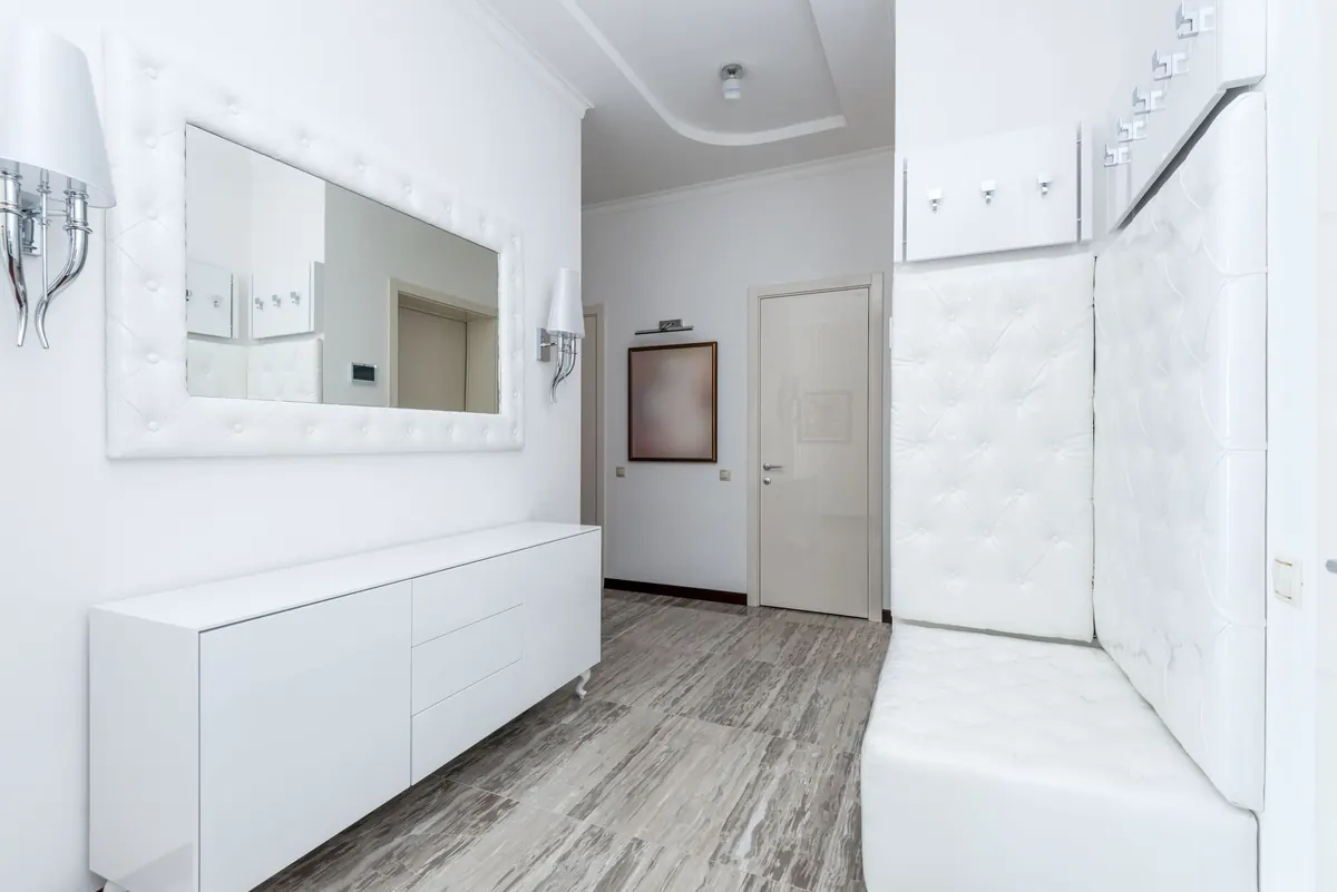
Skip anything described as brilliant, pure or cool white on the walls. Warm off-whites and soft creams, with touches of yellow, pink or beige in the base, look clean rather than cold. For trim, a crisp white can still work, but pick a warmer one than you would in a sunny room.
Greys
Green-greys, brown-greys, mushroom and stone are your friends here. Blue-based greys are the ones that go flat and shadowy, especially in the corners away from the window.
Stronger colours
Deep greens, teals, aubergines and clays can look genuinely beautiful in a north room — rich and enveloping rather than bright. Just expect them to their darkest, and plan lighting to lift them.
Shades that tend to work — and ones to watch
- Reliable: warm off-whites, stone and putty, sage and olive greens, clay and dusty pink neutrals, ochre and honey accents.
- Handle with care: blue-based greys, icy pastels, cool lilacs, pale blues and very stark whites.
- Drama, if you want it: deep forest green, ink, teal and aubergine — test these hardest of all.
Don't forget the ceiling, trim and floor
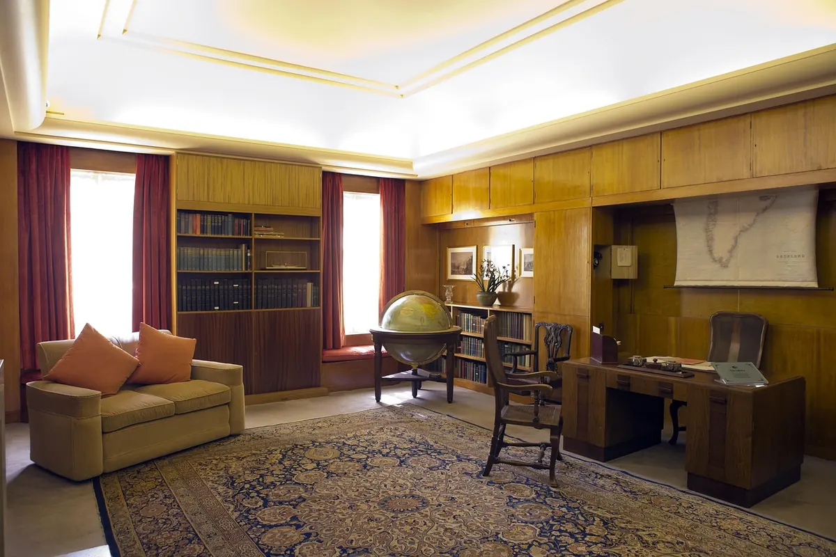
A bright white ceiling in a north room rarely reads as white; it reads as grey, and it can drag the whole space down. Painting the ceiling the same colour as the walls, or in the same shade mixed at half strength, softens the edges and makes a low-lit room feel taller and calmer. Warm wood, wool, rattan and linens all push the temperature back up. A large rug does more for a cold-feeling room than a whole afternoon of swatch comparison.
Test pots: how to use them properly
Small blobs painted straight onto the wall tell you almost nothing, because the existing colour underneath distorts them and you can't move them around. Do it like this instead:
- Buy tester pots in the finish you actually intend to use — sheen changes how light reflects, and a matt and an eggshell will read differently.
- Paint two coats onto large sheets of lining paper or A2 card, leaving a white border around the edge.
- Label the back, then let them dry completely. Colours shift a little as they cure.
- Pin them to the wall at eye level, upright, not flat on a table. Put one near the window and one on the darkest wall.
- Live with them for several days — morning, midday, evening and, crucially, at night with your lamps on.
- Compare no more than three at a time. More than that becomes noise, and you'll start choosing the label rather than the colour.
Paint for the hour you actually use the room
Most north-facing living rooms are used in the evening, when daylight is irrelevant and artificial light takes over. Warm bulbs, in the region of 2700K to 3000K, flatter warm tones and dull cool ones. If your evenings matter more than your Saturday afternoons, make the decision under the lighting you'll really live with. Layered light — a floor lamp, a table lamp, a wall light — will do more for a north room than any single paint choice.
Making the final call
Lean warmer, check the undertone against the things that are staying put, and give your sample boards a few days before deciding. When you do commit, buy enough for touch-ups and paint a full wall before you panic: wet paint looks quite different from dry, and one coat never looks right. If you're still stuck between two, choose the warmer and marginally deeper of the pair. A north-facing room rewards a little patience, and paint is never permanent.
Photo: kaboompics / Pixabay